
System Alert Behavior
System alerts can be triggered via behaviors. The alert can display a title, message, and between 1 and 3 labeled options. Each option has other behaviors associated with it. These associated behaviors get triggered when the user selects the corresponding option.
Alerts can be used in several ways:
- To inform the user of a performed action.
- To confirm a user's action before proceeding.
- To give the user a choice of options.
Here's an example of an alert behavior used to confirm a navigation. It has two options: one which will perform the navigation, and another one to stay on the current screen.
<behavior
  xmlns:alert="https://hyperview.org/hyperview-alert"
  trigger="press"
  action="alert"
  alert:title="Continue to next screen?"
  alert:message="Are you sure you want to navigate to the next screen?"
>
  <alert:option alert:label="Navigate" href="/next" action="push" />
  <alert:option alert:label="Cancel" />
</behavior>
Structure
Alert attributes and elements require their own namespace:
https://hyperview.org/hyperview-alert
Alert behaviors are created using the standard <behavior> element. To create an alert behavior, just set the action attribute to "alert". It's usually convenient to define the XML namespace on the <behavior> element too:
<behavior
  xmlns:alert="https://hyperview.org/hyperview-alert"
  trigger="longPress"
  action="alert"
/>
Note that any standard trigger can be used, as long as it's supported by the element containing the <behavior>.
The alert title and description are defined as namespaced attributes on the <behavior> element:
<behavior
xmlns:alert="https://hyperview.org/hyperview-alert"
trigger="longPress"
action="alert"
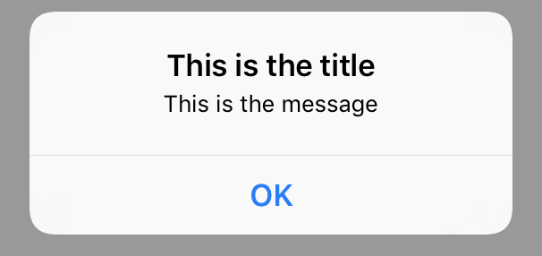
alert:title="This is the title"
alert:message="This is the message"
/>
The example above will trigger a simple alert. Since it provides no options, a single dismiss button will be included on the alert:
Using the <alert:option> element, you can define up to 3 pressable options that will appear on the alert. <alert:option> can either contain standard behavior attributes or <behavior> child elements.
<alert:option>can only respond to "press" triggers. Since this is the default trigger type, you can omit the "trigger" attribute.
If an <alert:option> element has no behaviors, pressing the option will dismiss the modal.
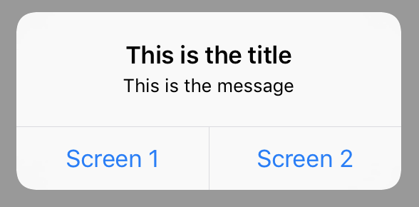
Here's an example of an alert with two options.
<behavior
  xmlns:alert="https://hyperview.org/hyperview-alert"
  trigger="longPress"
  action="alert"
  alert:title="This is the title"
  alert:message="This is the message"
>
  <alert:option alert:label="Screen 1" href="/screen1" action="push" />
  <alert:option alert:label="Screen 2" href="/screen2" action="new" />
</behavior>
Here's the same example, but using <behavior> elements instead. With behavior elements, multiple behaviors can be triggered in response to an option selection.
<behavior
  xmlns:alert="https://hyperview.org/hyperview-alert"
  trigger="longPress"
  action="alert"
  alert:title="This is the title"
  alert:message="This is the message"
>
  <alert:option alert:label="Screen 1">
    <behavior href="/screen1" action="push" />
  </alert:option>
  <alert:option alert:label="Screen 2">
    <behavior href="/screen2" action="new" />
  </alert:option>
</behavior>
Alert attributes
The following attributes are part of the https://hyperview.org/hyperview-alert namespace.
title
| Type | Required |
|---|---|
| string | Yes |
The title of the alert.
message
| Type | Required |
|---|---|
| string | No |
The descrption of the alert. Appears under the title. If not provided, only the title will appear.
Alert option attributes
The following attributes are part of the https://hyperview.org/hyperview-alert namespace.
label
| Type | Required |
|---|---|
| string | Yes |
The label of the alert option. Appears as a pressable button below the title and message.
style
| Type | Required |
|---|---|
| "default", "cancel" or "destructive" | No |
(iOS only) The style to be applied to the option's button - when unset, default style is "default"
Behavior attributes
See the standard behavior attributes. To support multiple behaviors, use <behavior> child elements instead.