
<picker-field>
The <picker-field> element represents a single-line input field. When pressed, the field focused and a modal appears, allowing the user to select one of the available options. The modal uses a platform-specific widget:
- on Android, it shows the system picker modal
- on iOS, the spinner-picker appears at the bottom of the screen
A picker field with no value selected:

On iOS, pressing the field brings up a bottom sheet modal with a picker
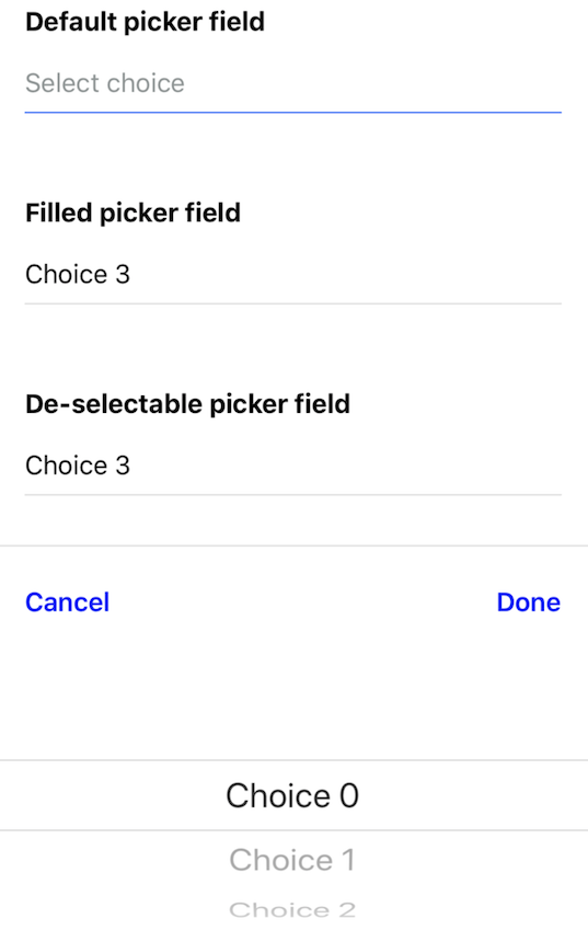
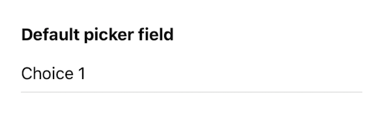
After selecting a value and pressing "Done", the field has the value selected.
Like other input elements, the selected value of the picker gets serialized by the parent form when making requests to the server.
<picker-field
  field-style="Input"
  field-text-style="Input__Text"
  name="user_choice"
  placeholder="Select choice"
>
  <picker-item label="Choice 0" value="0" />
  <picker-item label="Choice 1" value="1" />
  <picker-item label="Choice 2" value="2" />
  <picker-item label="Choice 3" value="3" />
</picker-field>
Structure
A <picker-field> element can appear anywhere within a <form> element. Its children must only be <picker-item> elements.
Attributes
namevalueplaceholderdone-labelcancel-labelfield-stylefield-text-stylemodal-stylemodal-text-styleidhideallowFontScalingmaxFontSizeMultiplierminimumFontScale
Behavior attributes
A <picker-field> element accepts the standard behavior attributes, including the following triggers:
name
| Type | Required |
|---|---|
| string | Yes |
The name of the picker field within a <form> element. This name will be used when serializing a form to form data that gets sent in a server request.
value
| Type | Required |
|---|---|
| string | No (defaults to blank) |
The value of the picker field. This string gets rendered into the string and can be edited by the user. Set this value in the XML to pre-populate the picker field.
placeholder
| Type | Required |
|---|---|
| string | No |
A label that appears within the picker field. The placeholder only appears when the field is empty.
done-label
| Type | Required |
|---|---|
| string | No |
This label appears in the button of the iOS modal. Pressing the button will apply the selected value to the field. Defaults to "Done".
cancel-label
| Type | Required |
|---|---|
| string | No |
This label appears in the button of the iOS modal. Pressing the button will ignore the selected value, and the value in the picker field will remain unchanged.
field-style
| Type | Required |
|---|---|
| string | No |
A space-separated list of styles to apply to the picker field container. This is the visual element that surrounds the selected picker value. You can use these styles to define borders, margin, and padding around the picker field. See Styles. Note that text style rules cannot be applied to the container.
field-text-style
| Type | Required |
|---|---|
| string | No |
A space-separated list of styles to apply to the text value of the picker field. Use these styles to define the font size, color, and weight of the value in the picker field. See Styles. Note that only text style rules can be applied to the text.
modal-style
| Type | Required |
|---|---|
| string | No |
A space-separated list of styles to apply to the iOS bottom-sheet modal. You can use these styles to define borders, margin, and padding around the bottom modal that appears on iOS. On Android, the system defines the look of the modal, so these styles will not be applied. See Styles. Note that text style rules cannot be applied to the modal.
modal-text-style
| Type | Required |
|---|---|
| string | No |
A space-separated list of styles to apply to the buttons in the iOS bottom-sheet modal. You can use these styles to define the size, color, and weight of the buttons in the iOS modal. On Android, the system defines the look of the modal, so these styles will not be applied. See Styles. Note that text style rules cannot be applied to the modal.
modal-animation-duration
| Type | Required |
|---|---|
| number | No |
The duration in milliseconds that the open and close animation (including the fading animation of the overlay) of the picker modal for IOS takes. Defaults to 250ms.
modal-overlay-animation-duration
| Type | Required |
|---|---|
| number | No |
The duration in milliseconds that the open and close animation of the picker modal overlay for IOS takes. Defaults to value of modal-animation-duration.
modal-dismiss-animation-duration
| Type | Required |
|---|---|
| number | No |
The duration in milliseconds that the close animation of the picker modal for IOS takes. Defaults to value of modal-animation-duration.
modal-dimiss-overlay-animation-duration
| Type | Required |
|---|---|
| number | No |
The duration in milliseconds that the close animation of the picker modal overlay for IOS takes. Defaults to value of modal-overlay-animation-duration.
id
| Type | Required |
|---|---|
| string | No |
A global attribute uniquely identifying the element in the whole document. Add an id if you need to reference this element in behavior attributes (either as a target or href source).
hide
| Type | Required |
|---|---|
| false (default), true | No |
If hide="true", the element will not be rendered on screen. If the element or any of the element's children have a behavior that triggers on "load" or "visible", those behaviors will not trigger while the element is hidden.
allowFontScaling
| Type | Required |
|---|---|
| boolean | No |
Specifies whether fonts should scale to respect Text Size accessibility setting
maxFontSizeMultiplier
| Type | Required |
|---|---|
| number | No |
Specifies whether fonts should scale to respect Text Size accessibility setting
minimumFontScale (iOS)
| Type | Required |
|---|---|
| number | No |
Specifies the smallest possible scale a font can reach when adjustsFontSizeToFit is enabled. (values 0.01-1.0).