Demo App Contributor Guide
Folder Structure
Index
Every page (or tab) in the app is represented as a folder and will have an associated index file. Any partial/fragment called by an example should reside in the same directory.
ui/ , case-studies/ , navigation/ , advanced/ are self-contained folders for each tab on the home screen. We follow the same structure for any pages inside.
Includes
All included files go under _includes/ folder to contain reusable files across the app. Eleventy surfaces its contents in the root:
templates/list.xml.njk: Renders a list of items, each linking to a different screen.section-list.xml.njk: Renders a section list of items with subtitles.tab.xml.njk: Basic tab structure for tabs on home screen.styles.xml.njk: Contains re-usable styles across the app.base.xml.njk: Base template for all the screens. Can be extended by providing custom styles and content.scrollview.xml.njk: Extendsbase.xml.njkto provide a scroll view for any screen that extends it.header.xml.njk: Used to render the header button logic.
icons/: All icons used across the app go into this folder.macros/: Folder that includes all reusable macros. Each macro should have a separate folder withindex.xml.njkcontaining the definition along withstyles.xml.njkcontaining the styles.
Examples with multiple demonstrations

For screens with a single demonstration, use index.xml.njk to include the logic.
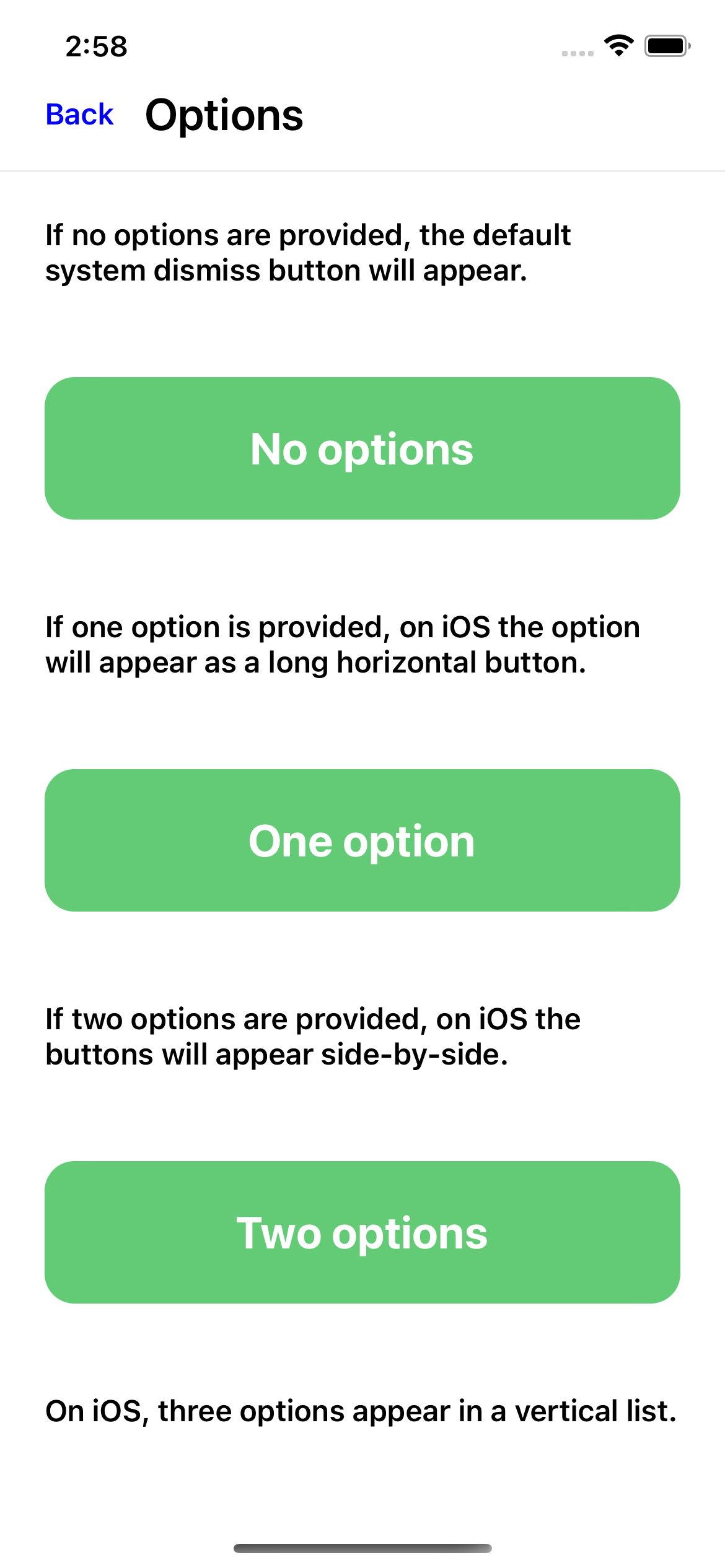
For screens with multiple demonstrations, each demonstration should be added through a separate file. The root index.xml.njk of the example styles include styles and an index file inside each demonstration folder. Any style common to multiple demonstrations of an example can be included in the example’s index.xml.njk. For example:
options/
  no-options/
    index.xml.njk
    styles.xml.njk # any style specific to no-option demonstration.
  one-option/
    index.xml.njk
    styles.xml.njk
  two-options/
    index.xml.njk
    styles.xml.njk
  index.xml.njk # includes all styles.xml.njk and index.xml.njk files
Order to lookup a style declaration: style.xml.njk of the demonstration → styles block in example’s index.xml.njk → _includes/styles.xml.njk
Eleventy’s Front Matter
Metadata used to define variables or settings that are used by eleventy while processing an .njk file. More details in 11ty's Front Matter data reference
Built-in Properties
permalink: The URL where the page will be available. In our case, the .xml file output./_data/eleventyComputed.jscomputes this automatically.tags: List of tags associated with the file. These tags can be used to categorize or filter files. For example, you might have a blog post with the tags ["programming", "python", "tutorial"]. These tags could be used to find all blog posts about programming, or all blog posts about Python.
Custom Properties
hv_tab_id: An identifier for a tab on the home screen. Used insidetab.xml.njkfor selecting the tab in tab barhv_button_behavior: A variable that controls the behavior of the header button on the page. In this case, can have values"close","none"and (default)"back"hv_list_tags: Used to specify a list oftagsthat should be displayed on the page. All files specifying a certainhv_list_tagsas theirtagsare included in the list.hv_title: The title of the page. This could be used in a<title>tag in the HTML head, or as a heading in the body of the page.hv_open_modal: Opens the example in a new modal instead of a screen if set totrue
Rendering List Items

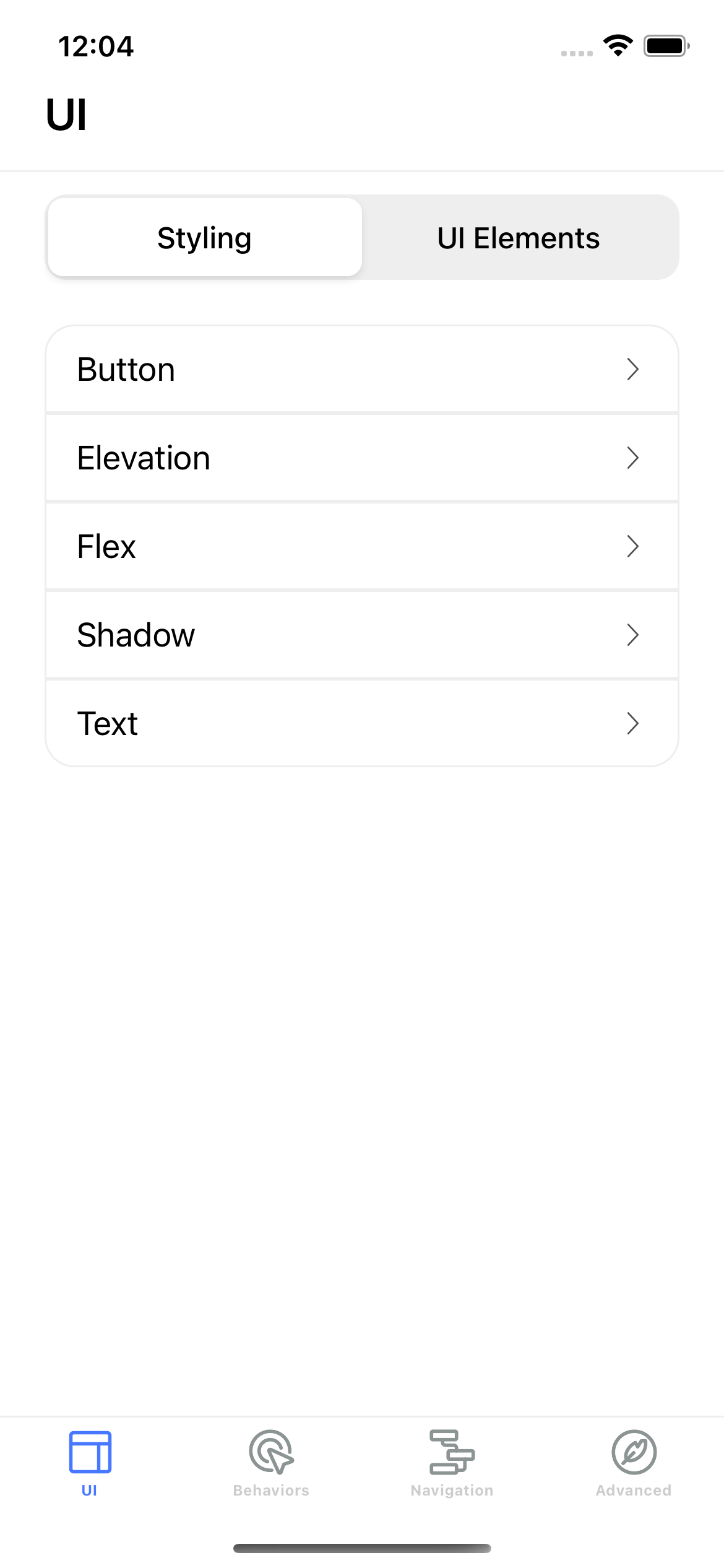
To render a list view as shown above:
- In
ui/index.xml.njk, includetemplates/list.xml.njkand definehv_list_tag: "UI/Styling" inside the metadata:
---
permalink: "/ui/styling/index.xml"
hv_title: "Styling"
hv_button_behavior: "back"
---
{% set hv_list_tag = "UI/Styling" %}
{% include "templates/list.xml.njk" %}
- In
ui/styling/button/index.xml.njk, define the tag which this item links to (in our case UI/Styling):
---
permalink: "/ui/styling/button/index.xml"
tags: "UI/Styling"
hv_title: "Button"
hv_button_behavior: "back"
---
{% extends 'templates/scrollview.xml.njk' %}
{# Custom logic for showing content after clicking UI Elements list item #}
Rendering Section List of Items
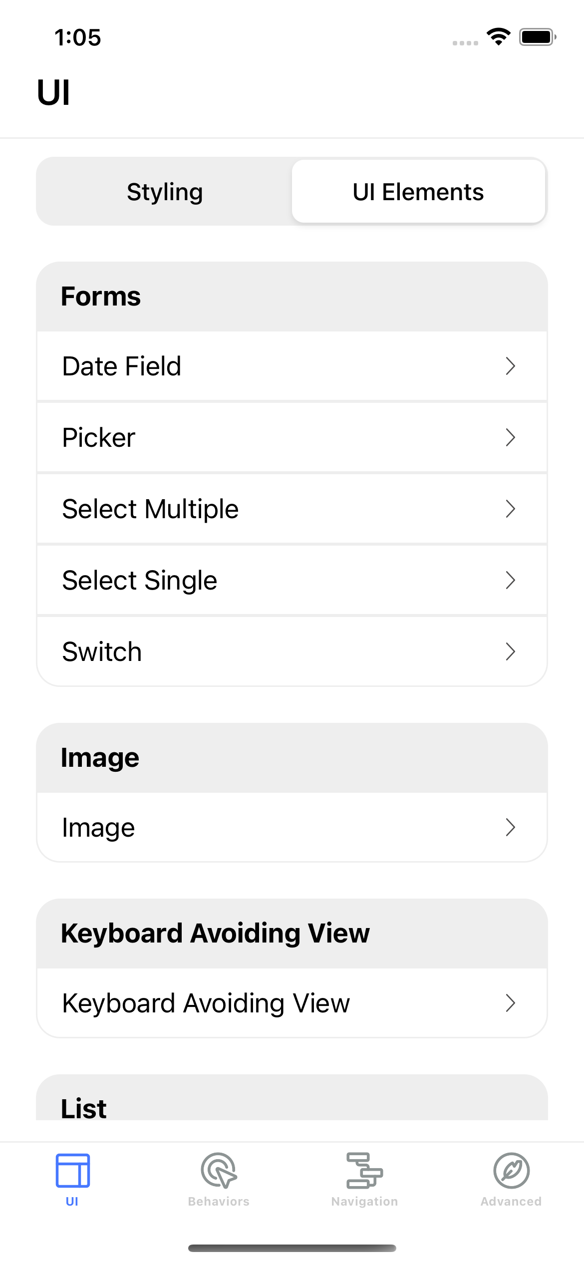
Renders item similar to list but also has sub titles to further group them
Uses hv_section_list_tag to group items.

Conventions
Href
All the href paths should start with /hyperview/public/ . This ensures that requested resource on both github pages and local setup is consistent.
Case
- File names, style ids are to follow kebab case, i.e. custom-select, custom-select-bold
- Private files that are not meant to be directly served as static file by the server:
a. should be prefixed with
_or placed in a directory starting with_b. should not define a front matter section - style ids and element ids should not overlap. i.e.,
<style id="container" />and<view id="container" /> - Tags should be capitalized and named after the parent directory of the file they represent. i.e.
Advanced/Case Studiesfor the items underadvanced/case-studies.
Files
- Every file ends with a line break
Front matter
- All custom front matter attributes start with prefix
hv_. example:hv_button_behavior - Built-in Properties come first followed by custom properties
Styles
- Include styles re-used across multiple screens inside
_includes/styles.xml.njk
XML attributes
We accept two formats to render attributes of an XML element:
- inline (provided that the total number of characters does not exceed 80)
- one attribute per line
When rendering the attributes inline, the element closing delimiter and the element closing tag should be on the same line. If the element is a self closing tag, there should be a single space between the last attribute's value and the self closing tag. If the element is not a self closing tag, there should be no leading space before the element delimiter. When rendering one attribute per line, the element delimiter should be rendered on a new line, and the indentation level should match the element opening tag. Use alphabetical order for XML element attributes, exception made for id which should be first attribute of the element.
i.e:
Do's
  <text id="foo"></text>
  <behavior href="/" />
  <behavior
    href="/"
    action="new"
  />
Dont's
  <text id="foo" ></text>
  <behavior href="/"/>
  <behavior
    href="/"
    action="new"/>
Getting Started with Demo App
Refer to this guide to setup demo app locally.
