
Advanced forms
The previous article showed the basics of styling form text fields, and handling form submissions with and without errors. In these examples, we'll cover some more advanced techniques, including different approaches to styling <select-single> and <select-multiple> elements.
Radio button styling
The standard UI choice for <option> elements in a <select-single> is the radio button:
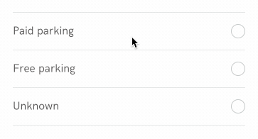
Looking at the anatomy of an option in the example above, we can break down the UI into 3 parts:
- the text label
- the outer border circle of the radio button
- the inner filled circled of the radio button that appears on selected options.
Therefore, let's add these three components within an <option> element and then style them appropriately.
<option style="Select__Option" value="paid_parking">
  <text style="Select__Label">Paid parking</text>
  <view style="Select__RadioOuter">
    <view style="Select__RadioInner" />
  </view>
</option>
<styles>
  <style id="Body" backgroundColor="white" flex="1" paddingTop="40" />
  <style
    id="Select__Option"
    flex="1"
    flexDirection="row"
    alignItems="center"
    justifyContent="space-between"
    paddingLeft="24"
    paddingRight="24"
    paddingBottom="16"
    paddingTop="16"
  />
  <style
    id="Select__RadioOuter"
    width="20"
    height="20"
    borderRadius="10"
    borderWidth="1"
    borderColor="#bdc4c4"
  >
    <modifier pressed="true">
      <style borderColor="#8d9494" borderWidth="1" />
    </modifier>
    <modifier selected="true">
      <style borderColor="#4778ff" borderWidth="2" />
    </modifier>
  </style>

  <style
    id="Select__RadioInner"
    width="10"
    height="10"
    borderRadius="5"
    opacity="0"
    marginTop="3"
    marginLeft="3"
  >
    <modifier selected="true">
      <style backgroundColor="#4778ff" opacity="1" />
    </modifier>
  </style>

  <style
    id="Select__Label"
    fontFamily="HKGrotesk-Regular"
    color="#4e4d4d"
    fontSize="16"
    lineHeight="18"
  >
    <modifier selected="true">
      <style color="#312f2f" />
    </modifier>
    <modifier pressed="true">
      <style color="#312f2f" />
    </modifier>
  </style>
</styles>
A couple of things to note:
Select__Optionuses flex styling withjustifyContent="space-between"to show the label on the left and radio button on the right.Select__RadioOuteruses modifier styles to define some extra states:- when pressed but not selected, make the outer border darker
- when selected, make the outer border blue and thicker.
Select__RadioInneruses modifier styles to only be visible when the option is selected. Visibility is controlled using opacity.Select__Labeluses modifier styles to subtly darken the label when pressed or selected.
Modifier styles apply to all children of the element being modified. In this case, the <option> element can be pressed or selected. However, children of the <option> element inherit the parent's state and can change appearance based on that modified state.
Checkbox button styling
The standard UI choice for <option> elements in a <select-multiple> is the checkbox. Implementing a checkbox is identical to implementing the radio button, except that the checkbox can't be visually represented using nested <view> elements. Instead, we could use an image of a check inside a view with a border. To hide the check, the default image dimensions would be width="0" and height="0". The modifier style for selected="true" would set the correct image dimensions to render the check.
Tag styling
There are many occasions in which radio buttons or checkboxes may not be the best choice of UI. Since developers can completely control the styling of <option> elements, it's easy to change their appearance to suit a particular need.
For example, imagine this tag-picking UI:
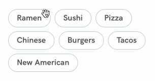
Since the user can select multiple tags, we will use the <select-multiple> element to capture this input. The <option> elements simply contain a text element with the tag name.
<select-multiple style="Tags" name="tag">
  <option style="Tag" value="Ramen">
    <text style="Tag__Label">Ramen</text>
  </option>
  <option style="Tag" value="Sushi">
    <text style="Tag__Label">Sushi</text>
  </option>
  <option style="Tag" value="Pizza">
    <text style="Tag__Label">Pizza</text>
  </option>
  <!-- more options -->
</select-multiple>
Much like in the examples above, with style and modifier rules, we can make the options look like tag bubbles. The <select-multiple> element uses flexbox styling with flexDirection and flexWrap to display the options:
<styles>
  <style
    id="Tags"
    flex="1"
    flexDirection="row"
    flexWrap="wrap"
    justifyContent="flex-start"
    marginLeft="24"
    marginRight="24"
    marginTop="40"
  />
  <style
    id="Tag"
    marginBottom="8"
    marginRight="8"
    paddingLeft="16"
    paddingRight="16"
    paddingTop="8"
    paddingBottom="8"
    borderRadius="32"
    borderWidth="1"
    borderColor="#bdc4c4"
  >
    <modifier selected="true">
      <style backgroundColor="#4778ff" borderColor="white" />
    </modifier>
  </style>
  <style
    id="Tag__Label"
    fontFamily="HKGrotesk-Bold"
    color="#4e4d4d"
    fontSize="16"
    lineHeight="18"
  >
    <modifier selected="true">
      <style color="white" />
    </modifier>
  </style>
</styles>
Conditional fields
Another common pattern is to provide a "custom" option if none of the available options fit the user's needs:
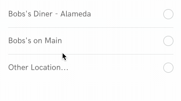
We can build this feature by extending the example above.
<select-single style="Select" name="location">
  <option style="Select__Option" value="alameda">
    <text style="Select__Label">Bobs's Diner - Alameda</text>
    <view style="Select__RadioOuter"><view style="Select__RadioInner" /></view>
  </option>
  <view style="Select__Separator" />
  <option style="Select__Option" value="main">
    <text style="Select__Label">Bobs's on Main</text>
    <view style="Select__RadioOuter"><view style="Select__RadioInner" /></view>
  </option>
  <view style="Select__Separator" />
  <option style="Select__Option" value="other">
    <!-- begin change -->
    <behavior trigger="select" href="#otherLocationInput" action="replace-inner" target="otherLocation" />
    <behavior trigger="deselect" href="#null" action="replace-inner" target="otherLocation" />
    <!-- end change -->
    <text style="Select__Label">Other Location...</text>
    <view style="Select__RadioOuter"><view style="Select__RadioInner" /></view>
  </option>
</select-single>
<!-- begin change -->
<view id="otherLocation" />
<view hide="true">
  <view id="null" />
  <view id="otherLocationInput" style="FormGroup">
    <text-field name="location_other" style="Input" placeholder="Location Name" placeholderTextColor="#8D9494" />
  </view>
</view>
<!-- end change -->
The styling of the radio buttons and text fields stay the same. There are a few minor changes to make this feature work:
<view id="otherLocation" />holds the "other location" field, when shown.- a hidden
<view>contains two elements:<view id="null" />is simply an empty view<view id="otherLocationInput" />contains a text field for entering a custom location.
- The "Other Location..." option contains two behaviors:
- when selected, Hyperview will clone the element with id
otherLocationInputintootherLocation. - when deselected, Hyperview will clone the element with id
nullintootherLocation.
- when selected, Hyperview will clone the element with id
In this case, the logic is simple enough that we could include the "other location" field in the initial screen response. However, if we needed more sophisticated logic to render the conditional field, we could make a request to the backend with the contents of the form to determine what type of field to display.