Basic forms
Hyperview supports sending user input with requests through the <form> element. Using server-side validation, the response can either show validation errors, or accept the input and take the user to a next page.
Styling inputs
Form & input elements have no default styling in Hyperview, to give developers maximum flexibility over the look & feel of their app. Before we start creating a form, it's helpful to define a few base styles for UI elements that will be used frequently:
<screen>
  <styles>
    <style
      id="FormGroup"
      flex="1"
      marginLeft="24"
      marginRight="24"
      marginTop="24"
    />
    <style
      id="Input"
      borderBottomColor="#E1E1E1"
      borderBottomWidth="1"
      borderColor="#4E4D4D"
      flex="1"
      fontFamily="HKGrotesk-Regular"
      fontSize="16"
      paddingBottom="8"
      paddingTop="8"
    />
    <style
      id="Label"
      borderColor="#4E4D4D"
      fontFamily="HKGrotesk-Bold"
      fontSize="16"
      lineHeight="24"
      marginBottom="8"
    />
    <style
      id="Help"
      borderColor="#FF4847"
      fontFamily="HKGrotesk-Regular"
      fontSize="16"
      lineHeight="24"
      marginTop="16"
    />
  </styles>

  <body>
    <view style="FormGroup">
      <text style="Label">Label line</text>
      <text-field
        name="data"
        style="Input"
        placeholder="Placeholder"
        placeholderTextColor="#8D9494"
      />
      <text style="Help">Help line</text>
    </view>
  </body>
</screen>
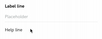
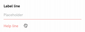
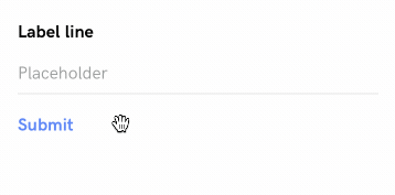
We wrap a <text-field> element with a "form group" view that provides consistent margins for all fields in a form. The form group view consists of a <text> label, <text-field> input element, and <text> label with helpful information.
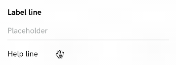
An nice enhancement is to change the style of the text field when focused:
<screen>
  <styles>
    <style
      id="FormGroup"
      flex="1"
      marginLeft="24"
      marginRight="24"
      marginTop="24"
    />
    <style
      id="Input"
      borderBottomColor="#E1E1E1"
      borderBottomWidth="1"
      borderColor="#4E4D4D"
      flex="1"
      fontFamily="HKGrotesk-Regular"
      fontSize="16"
      paddingBottom="8"
      paddingTop="8"
    >
      <!-- begin change -->
      <modifier focused="true">
        <style borderBottomColor="#4778FF" />
      </modifier>
      <!-- end change -->
    </style>
    <style
      id="Label"
      borderColor="#4E4D4D"
      fontFamily="HKGrotesk-Bold"
      fontSize="16"
      lineHeight="24"
      marginBottom="8"
    />
    <style
      id="Help"
      borderColor="#FF4847"
      fontFamily="HKGrotesk-Regular"
      fontSize="16"
      lineHeight="24"
      marginTop="16"
    />
  </styles>

  <body>
    <view style="FormGroup">
      <text style="Label">Label line</text>
      <text-field
        name="data"
        style="Input"
        placeholder="Placeholder"
        placeholderTextColor="#8D9494"
      />
      <text style="Help">Help line</text>
    </view>
  </body>
</screen>
We modify the <style id="Input"> rule with a "focused" modifier that changes the bottom border color of the text field:
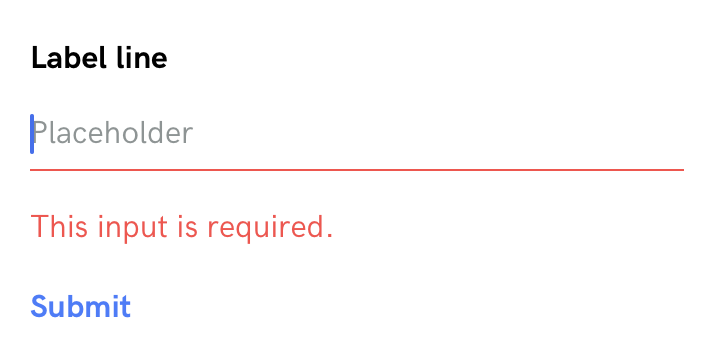
Additionally, a usable form input element should have an error state. We'll add extra styles to render the text input and help label using red color.
<screen>
  <styles>
    <style
      id="FormGroup"
      flex="1"
      marginLeft="24"
      marginRight="24"
      marginTop="24"
    />
    <style
      id="Input"
      borderBottomColor="#E1E1E1"
      borderBottomWidth="1"
      borderColor="#4E4D4D"
      flex="1"
      fontFamily="HKGrotesk-Regular"
      fontSize="16"
      paddingBottom="8"
      paddingTop="8"
    >
      <modifier focused="true">
        <style borderBottomColor="#4778FF" />
      </modifier>
    </style>
    <style
      id="Label"
      borderColor="#4E4D4D"
      fontFamily="HKGrotesk-Bold"
      fontSize="16"
      lineHeight="24"
      marginBottom="8"
    />
    <style
      id="Help"
      borderColor="#FF4847"
      fontFamily="HKGrotesk-Regular"
      fontSize="16"
      lineHeight="24"
      marginTop="16"
    />
    <!-- begin change -->
    <style id="Input--Error" borderBottomColor="#FF4847" color="#FF4847">
      <modifier focused="true">
        <style borderBottomColor="#FF4847" />
      </modifier>
    </style>
    <style id="Help--Error" color="#FF4847" />
    <!-- end change -->
  </styles>

  <body>
    <view style="FormGroup">
      <text style="Label">Label line</text>
      <text-field
        name="data"
        style="Input Input--Error"
        placeholder="Placeholder"
        placeholderTextColor="#8D9494"
      />
      <text style="Help Help--Error">Help line</text>
    </view>
  </body>
</screen>
By adding Input--Error and Help--Error styles to elements in the form group, we can represent validation errors:
Submitting forms
Now that we have styling for form group elements, we can incorporate the <form> element to do something with the input data. When an element in the form triggers a behavior that makes a remote request, the form data is serialized and included in the request.
<screen>
  <styles>
    <style
      id="FormGroup"
      flex="1"
      marginLeft="24"
      marginRight="24"
      marginTop="24"
    />
    <style
      id="Input"
      borderBottomColor="#E1E1E1"
      borderBottomWidth="1"
      borderColor="#4E4D4D"
      flex="1"
      fontFamily="HKGrotesk-Regular"
      fontSize="16"
      paddingBottom="8"
      paddingTop="8"
    >
      <modifier focused="true">
        <style borderBottomColor="#4778FF" />
      </modifier>
    </style>
    <style
      id="Label"
      borderColor="#4E4D4D"
      fontFamily="HKGrotesk-Bold"
      fontSize="16"
      lineHeight="24"
      marginBottom="8"
    />
    <style
      id="Help"
      borderColor="#FF4847"
      fontFamily="HKGrotesk-Regular"
      fontSize="16"
      lineHeight="24"
      marginTop="16"
    />
    <style id="Input--Error" borderBottomColor="#FF4847" color="#FF4847">
      <modifier focused="true">
        <style borderBottomColor="#FF4847" />
      </modifier>
    </style>
    <style id="Help--Error" color="#FF4847" />
    <style
      id="Submit"
      color="#4778FF"
      marginLeft="24"
      marginTop="16"
      fontSize="16"
      lineHeight="24"
      fontFamily="HKGrotesk-Bold"
      fontWeight="bold"
    />
  </styles>

  <body>
    <form id="myForm">
      <view style="FormGroup">
        <text style="Label">Label line</text>
        <text-field
          name="data"
          style="Input"
          placeholder="Placeholder"
          placeholderTextColor="#8D9494"
        />
        <text style="Help">Help line</text>
      </view>
      <text
        style="Submit"
        href="/case_studies/basic_form/submit.xml"
        verb="post"
        target="myForm"
        action="replace"
        show-during-load="mySpinner"
      >
        Submit
      </text>
    </form>
    <spinner id="mySpinner" hide="true" />
  </body>
</screen>
The markup above wraps the input in a <form> element with id="myForm". Within the form, we've added a submit link with behavior attributes:
href="/case_studies/basic_form/submit.xml"specifies the remote request path.verb="post"specifies the HTTP request method used to make the request.target="myForm"andaction="replace"tells Hyperview that the response content should replace the form on the current screen. This allows the response to show validation errors on the same screen.show-during-load="mySpinner"indicates that the spinner should be toggled while making the HTTP request.
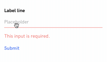
The result depends on the server response. Assuming the server determines the form data is invalid, then the response should re-render the <form> element using the Input--Error and Help-Error styles. The help label should include a message explaining why the input was invalid:
<form id="myForm" xmlns="https://hyperview.org/hyperview">
  <view style="FormGroup">
    <text style="Label">Label line</text>
    <text-field
      name="data"
      value=""
      style="Input Input--Error"
      placeholder="Placeholder"
      placeholderTextColor="#8D9494"
    />
    <text style="Help Help--Error">This input is required.</text>
  </view>
  <text
    style="Submit"
    href="/case_studies/basic_form/submit.xml"
    verb="post"
    target="myForm"
    action="replace"
    show-during-load="mySpinner"
  >
    Submit
  </text>
</form>
Assuming the server determines the form data is valid, then the response can contain a message indicating the form submission was successful. It's common to navigate to a new screen on success. This can be achieved with a <behavior> element in the response that triggers on load.
<form id="myForm" xmlns="https://hyperview.org/hyperview">
  <view style="FormGroup">
    <text style="Label">Label line</text>
    <text-field
      name="data"
      value=""
      style="Input"
      placeholder="Placeholder"
      placeholderTextColor="#8D9494"
    />
  </view>
  <text style="Submit">Saved!</text>
  <behavior trigger="load" href="/case_studies/basic_form/next.xml" />
</form>