Photo sharing app
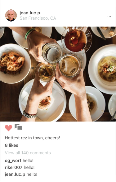
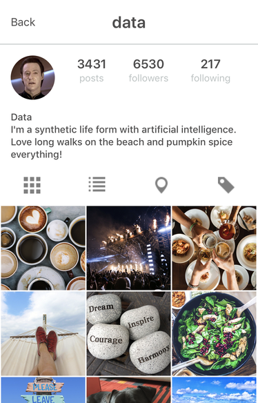
This case study replicates the functionality of a photo-sharing app. It consists of two screens: a feed of shared images, with comments and likes, and a user profile that shows a grid of images shared by a specific user. The feed supports sticky image headers, toggling likes, loading more comments, and tapping user names to load the profile screen.
Sticky headers
As the user scrolls the list of images, the image header (with username, avatar and location) sticks to the top of the screen.

In Hyperview, we can achieve this effect by building the main UI around a <section-list> element. A sectionlist supports many items in each section, but in this case each section will only contain one item: the image with comments.
<section-list>
  <section key="1">
    <section-title style="ImageHeader">
      <view style="ImageHeader__Left">
        <image
          source="/case_studies/photos/avatars/riker.jpg"
          style="ImageHeader__Avatar"
          href="/case_studies/photos/index.xml"
        />
        <view style="ImageHeader__LeftLabels">
          <text
            style="ImageHeader__Username"
            href="/case_studies/photos/user.xml"
          >riker007</text>
          <text style="ImageHeader__Location">Las Vegas, CA</text>
        </view>
      </view>
      <view style="ImageHeader__Right">
        <text style="ImageHeader__More">...</text>
      </view>
    </section-title>
    <item key="image1">
      <!-- markup for image and comments goes here -->
    </item>
  </section>
</section-list>
The <section-title> element can be styled like a <view>. For this app, the title has a row layout with a left and right container. The left container has an avatar, username, and location.
<styles>
  <style
    id="ImageHeader"
    flex="1"
    flexDirection="row"
    paddingLeft="16"
    paddingRight="16"
    alignItems="center"
    backgroundColor="white"
    paddingTop="16"
    paddingBottom="16"
    justifyContent="space-between"
  />
  <style
    id="ImageHeader__Avatar"
    height="40"
    width="40"
    borderRadius="24"
    backgroundColor="#F4F4F4"
  />
  <style id="ImageHeader__Left" flexDirection="row" />
  <style id="ImageHeader__LeftLabels" marginLeft="8" justifyContent="center" />
  <style
    id="ImageHeader__Username"
    fontWeight="bold"
    fontSize="14"
    color="#4E4D4D"
  />
  <style
    id="ImageHeader__Location"
    fontWeight="normal"
    fontSize="14"
    color="#BDC4C4"
  />
  <style id="ImageHeader__Right" flexDirection="row" />
  <style
    id="ImageHeader__more"
    fontWeight="bold"
    fontSize="14"
    color="#BDC4C4"
  />
</styles>
Note that the stories section above the first image is also part of the section list. For this section, the <section-title> element is empty. The only item in the section contains a horizontal scroll list of stories.
<section key="stories">
  <section-title />
  <item key="stories">
    <view style="Stories" scroll="true" scroll-orientation="horizontal">
      <view style="Story" href="/case_studies/photos/geordi.xml">
        <image
          source="/case_studies/photos/avatars/geordi.jpg"
          style="Story__Avatar"
        />
        <text style="Story__Username" numberOfLines="1">geordi</text>
      </view>
      <view style="Story" href="/case_studies/photos/data.xml">
        <image
          source="/case_studies/photos/avatars/data.jpg"
          style="Story__Avatar"
        />
        <text style="Story__Username" numberOfLines="1">data</text>
      </view>
      <view style="Story" href="/case_studies/photos/deanna.xml">
        <image
          source="/case_studies/photos/avatars/deanna.png"
          style="Story__Avatar"
        />
        <text style="Story__Username" numberOfLines="1">deanna.troi</text>
      </view>
      <view style="Story" href="/case_studies/photos/picard.xml">
        <image
          source="/case_studies/photos/avatars/picard.jpg"
          style="Story__Avatar"
        />
        <text style="Story__Username" numberOfLines="1">jean.luc.p</text>
      </view>
      <view style="Story" href="/case_studies/photos/worf.xml">
        <image
          source="/case_studies/photos/avatars/worf.jpg"
          style="Story__Avatar"
        />
        <text style="Story__Username" numberOfLines="1">og_worf</text>
      </view>
    </view>
  </item>
</section>
<styles>
  <style
    id="Stories"
    flex="1"
    flexDirection="row"
    backgroundColor="#F4F4F4"
    paddingLeft="8"
  />
  <style
    id="Story"
    flex="1"
    alignItems="center"
    marginLeft="8"
    marginRight="8"
    marginBottom="8"
    marginTop="8"
  />
  <style
    id="Story__Avatar"
    height="64"
    width="64"
    borderRadius="32"
    backgroundColor="#F4F4F4"
  />
  <style id="Story__Username" fontWeight="bold" fontSize="14" marginTop="4" />
</styles>
Liking an image
A heart icon below each image can be toggled to like or unlike the image. Pressing the heart icon immediately updates the state of the icon, and also reflects the new like count below.
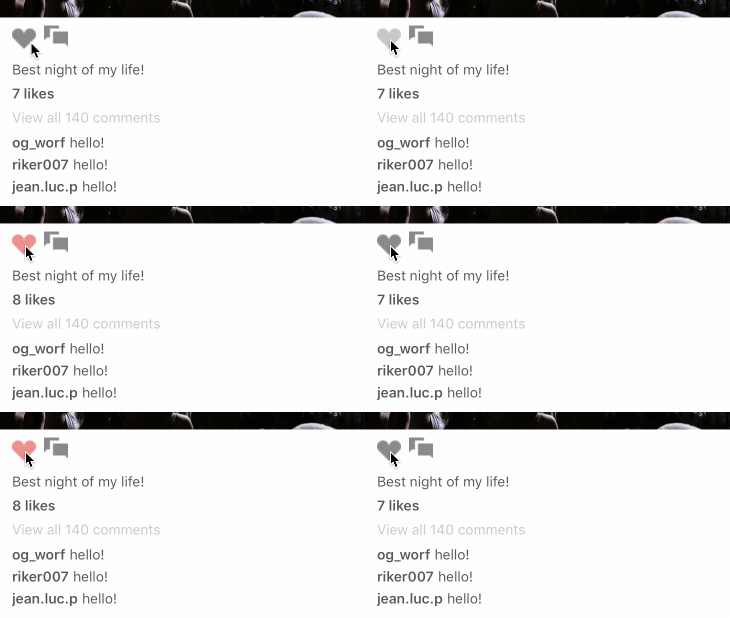
The heart icon is actually implemented as a <select-multiple> element with a single <option>. This allows us to track the selected state locally. By using modifiers on the style of the option, we can hide or show the appropriate icon.
<select-multiple name="image1-like">
  <option value="like" style="ActionBar__Icon ActionBar__Icon--First">
    <image
      source="/case_studies/photos/icons/heart.png"
      style="ActionBar__IconImage"
    />
    <image
      source="/case_studies/photos/icons/heart_liked.png"
      style="ActionBar__IconImage--Selected"
    />
  </option>
</select-multiple>
The markup for the option element contains an image for both the selected and unselected state. Each version has a separate style id.
<styles>
  <style id="ActionBar__IconImage" width="24" height="24">
    <modifier selected="true">
      <style width="0" height="0" />
    </modifier>
  </style>
  <style id="ActionBar__IconImage--Selected" width="0" height="0">
    <modifier selected="true">
      <style width="24" height="24" />
    </modifier>
  </style>
</styles>
Based on the style id, we show or hide the image based on the modifier state. By setting the width and height of the image to 0, we effectively hide the image.
Pressing the icon makes a request to the backend in order to save the state to the server. We then update the count of the total number of likes. This is done with behavior attributes to target the element that shows the number of likes. We also specify the trigger in order to execute the appropriate behavior based on whether the image was liked or unliked.
<select-multiple name="image1-like">
  <option value="like" style="ActionBar__Icon ActionBar__Icon--First">
    <behavior
      trigger="select"
      href="/case_studies/photos/num_likes_increase.xml"
      action="replace"
      target="image1-num-likes"
    />
    <behavior
      trigger="deselect"
      href="/case_studies/photos/num_likes_decrease.xml"
      action="replace"
      target="image1-num-likes"
    />
    <image
      source="/case_studies/photos/icons/heart.png"
      style="ActionBar__IconImage"
    />
    <image
      source="/case_studies/photos/icons/heart_liked.png"
      style="ActionBar__IconImage--Selected"
    />
  </option>
</select-multiple>
The server response simply indicates the new count:
<text
  xmlns="https://hyperview.org/hyperview"
  id="image1-num-likes"
  style="Comments__Likes"
>
  8 likes
</text>
Loading comments
Images with lots of comments don't load all of the comments at once. Instead, a "more comments" link loads a few more comments on every press.
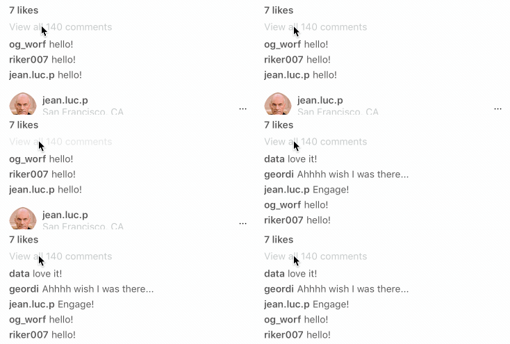
The interaction uses behavior attributes to implement the interaction. When pressed, we make a request to a server for the additional comments. The response gets prepended to the comments container, as specified by action="prepend" and target="comments-image1".
<view style="Comments">
  <text id="image1-num-likes" style="Comments__Likes">7 likes</text>
  <text
    style="Comments__More"
    href="/case_studies/photos/more_comments.xml"
    action="prepend"
    target="comments-image1"
  >
    View all 140 comments
  </text>
  <view id="comments-image1">
    <view style="Comment">
      <text
        style="Comment__Author"
        href="/case_studies/photos/user.xml"
      >og_worf</text>
      <text style="Comment__Content">hello!</text>
    </view>
  </view>
</view>
The server response consists of a wrapper element containing the new comments.
<view xmlns="https://hyperview.org/hyperview">
 <view style="Comment">
    <text
      style="Comment__Author"
      href="/case_studies/photos/user.xml"
    >data</text>
    <text style="Comment__Content">love it!</text>
  </view>
  <view style="Comment">
    <text
      style="Comment__Author"
      href="/case_studies/photos/user.xml"
    >geordi</text>
    <text style="Comment__Content">Ahhhh wish I was there...</text>
  </view>
  <view style="Comment">
    <text
      style="Comment__Author"
      href="/case_studies/photos/user.xml"
    >jean.luc.p</text>
    <text style="Comment__Content">Engage!</text>
  </view>
</view>
In an implementation backed by a real server, we may instead wish to include the "More comments" element in the response, so that it gets replaced on every request. By replacing the link, the server can switch out the href to implement pagination.
Image grid
On the profile page, images appear in a grid with 3 columns.

By using Flexbox styling with flexWrap="wrap", we can simply add all images in a flat list of elements.
<styles>
  <style id="Images" flex="1" flexDirection="row" flexWrap="wrap" borderWidth="1" borderColor="white" />
  <style id="Image" width="124" height="124" borderColor="white" borderWidth="1" />
</styles>

<view style="Images">
  <image style="Image" source="/case_studies/photos/photos/1.jpeg" />
  <image style="Image" source="/case_studies/photos/photos/2.jpeg" />
  <image style="Image" source="/case_studies/photos/photos/3.jpeg" />
  <image style="Image" source="/case_studies/photos/photos/4.jpeg" />
  <!-- more images -->
</view>
Images require an explicit width and height, but different devices will have different screen dimensions. The calculation for the image size can be done on the server. The server request includes a custom header X-Hyperview-Dimensions of the form 375w 800h. The width and height of the image can be calculated by dividing the width by 3.
See the code
For the full example, browse the full code in the Hyperview Github repo.
