Instawork for Business
The Instawork app allows restaurants, bars, catering, and hospitality businesses to find talented staff. One feature of the app, Instawork Gigs, allows booking on-demand workers with just a few simple taps. Users can see upcoming and past gigs or rate & leave feedback for past workers.
The entire Gigs tab within the app is implemented using Hyperview.
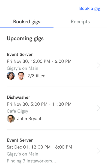
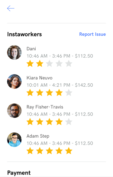
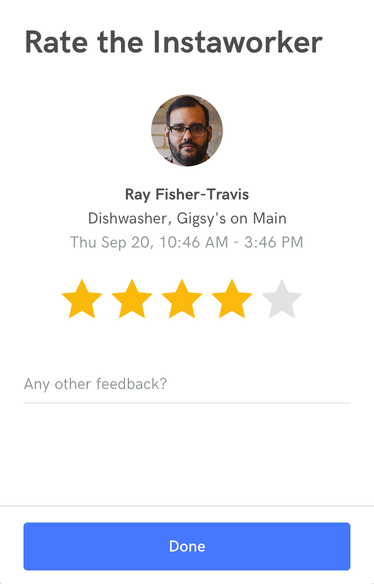
This article highlights some of the techniques used to create a production-level app using Hyperview.
Main screen layout
The main screen of Instawork Gigs uses a tabbed layout. The first tab loads a list of upcoming gigs, while the Receipts tab shows information about past gigs. The basic layout looks like this:
<view style="Flex" id="tabsAndContent">
  <select-single style="TabBar">
    <!-- tabs go here -->
  </select-single>

  <view style="Main">
    <list id="shiftGroupList">
      <!-- list items go here -->
    </list>

    <view id="shiftGroupListLoad" hide="true" style="Flex">
      <!-- elements showing placeholder loading state goes here -->
    </view>
  </view>
</view>
tabsAndContentwraps the tab bar and content area. The content area can include a list or empty state. This element is targeted for replacement when the user presses a tab.shiftGroupListrepresents the list of gigs in either tab. The list is replaced when doing a pull-to-refresh. Gigs are also appended to this list when loading more items.shiftGroupListLoadcontains markup for a loading state. This loading state gets displayed while we make a request during a tab switch.
Tabs
Tabs are implemented using the technique described in the earlier example.
<select-single style="TabBar">
  <option
    value="booked"
    selected="true"
    style="TabBar__Tab Flex"
    trigger="select"
    href="/biz_app/gigs/groups?type=booked&page=1"
    action="replace"
    target="tabsAndContent"
    hide-during-load="shiftGroupList"
    show-during-load="shiftGroupListLoad"
  >
    <view style="TabBar__Inner">
      <text style="TabBar__Label">Booked gigs</text>
    </view>
  </option>
  <option
    value="receipts"
    style="TabBar__Tab Flex"
    trigger="select"
    href="/biz_app/gigs/groups?type=receipts&page=1"
    action="replace"
    target="tabsAndContent"
    hide-during-load="shiftGroupList"
    show-during-load="shiftGroupListLoad"
  >
    <view style="TabBar__Inner">
      <text style="TabBar__Label">Receipts</text>
    </view>
  </option>
</select-single>
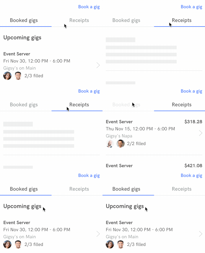
Tabs are implemented as a <select-single> element. When a user selects a tab, we request content from the server and replace tabsAndContent with the response. During the request, we hide the current list and show the placeholder.
The styles for the tabs use modifier styles to represent the selected state:
<style id="TabBar" flexDirection="row"/>
<style id="TabBar__Tab" flex="0" borderBottomColor="#E1E3E3" borderBottomWidth="1">
  <modifier selected="true">
    <style borderBottomWidth="1" borderBottomColor="#4778FF"/>
  </modifier>
</style>
<style id="TabBar__Inner" borderBottomWidth="1" borderBottomColor="transparent">
  <modifier selected="true">
    <style borderBottomColor="#4778FF"/>
  </modifier>
</style>
<style id="TabBar__Label" paddingBottom="8" textAlign="center" paddingTop="8" fontSize="18" lineHeight="24" color="#8D9494">
  <modifier selected="true">
    <style color="#4E4D4D"/>
  </modifier>
</style>
Pull-to-refresh
Within each tab, the list can be refreshed using the pull-to-refresh gesture, implemented like the earlier example.
<list
  id="shiftGroupList"
  trigger="refresh"
  href="/biz_app/gigs/groups?type=receipts&page=1"
  action="replace"
  target="tabsAndContent"
>
  <!-- items go here -->
</list>
Adding a trigger to the list that re-fetches the current screen and replaces tabsAndContent. The href depends on the content of the current tab.
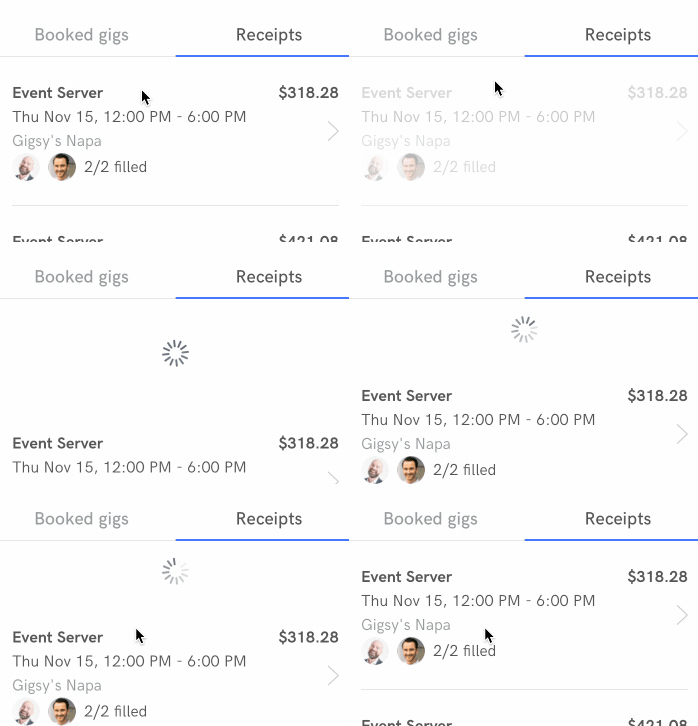
Infinite scroll
When reaching the bottom of the list, the app requests more content from the server. Infinite scroll is implemented following the earlier example.
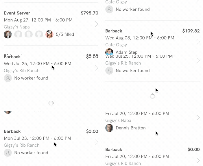
If the server knows that there are more items in the list, it adds a final <item> that displays a spinner.
<list
  id="shiftGroupList"
  trigger="refresh"
  href="/biz_app/gigs/groups?type=receipts&page=1"
  action="replace"
  target="tabsAndContent"
>
  <item
    key="spinner-wqeNRog"
    trigger="visible"
    href="/biz_app/gigs/groups?items_only=true&type=receipts&page=2"
    action="replace"
    once="true"
    style="ShiftGroup__Spinner"
  >
    <spinner />
  </item>
</list>
This spinner item contains behavior attributes that control the load:
trigger="visible"executes the behavior when the spinner appears on screenonce="true"executes the behavior only the first time the spinner appearsaction="replace"replaces the spinner item with the server response.
The server response contains a <view> wrapper around the new <item> elements to add to the list:
<view xmlns="https://instawork.com/hyperview">
  <!-- more items here -->
</view>
Replacing the spinner item with the new content also takes care of removing the spinner when the behavior finishes executing.
Loading states
On the past gigs screen, tapping on a worker opens a modal where the user can rate the worker. Note that while loading the modal, we show a custom loading state: "Rate the Instaworker" appears immediately while loading the modal.
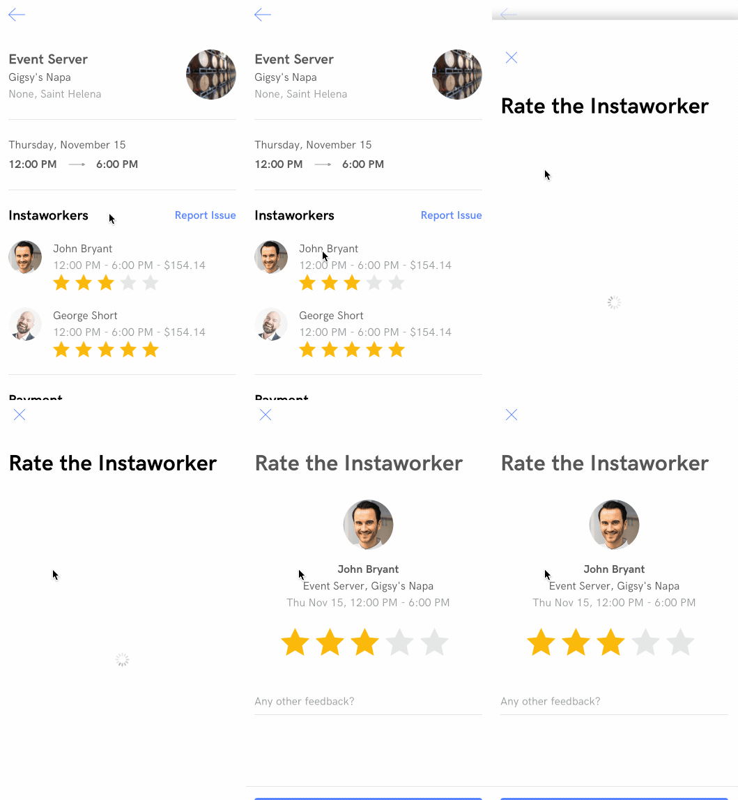
First, let's take a look at how to trigger the modal. We simply add a <behavior> element to the <item> representing the worker, with an href to the worker <view> with action="new" to use a modal.
Each star also has an href (with a query param that pre-selects the pressed start) and action="new". Note that unlike HTML, we can nest elements with href behaviors.
<item key="dj4kXoN" style="ShiftItem">
  <behavior href="/biz_app/gigs/shifts/dj4kXoN/feedback" action="new" />
  <view style="ShiftAvatar">
    <image
      style="Avatar "
      source="https://instawork-profile-dev.imgix.net/43509/man1.jpg?crop=faces&fit=crop&mask=ellipse&fm=png&h=192&w=192"
    />
  </view>
  <view style="ShiftItem__Info">
    <text style="ShiftItem__WorkerName">John Bryant</text>
    <text style="ShiftItem__Details">12:00 PM - 6:00 PM - $154.14</text>
    <view style="Rating">
      <image
        source="/static/img/biz-app/star_filled%402x.png"
        action="new"
        href="/biz_app/gigs/shifts/dj4kXoN/feedback?rating=1"
        show-during-load="loadingScreen"
        style="Rating__Star"
      />
      <image
        source="/static/img/biz-app/star_filled%402x.png"
        action="new"
        href="/biz_app/gigs/shifts/dj4kXoN/feedback?rating=2"
        show-during-load="loadingScreen"
        style="Rating__Star"
      />
      <image
        source="/static/img/biz-app/star_filled%402x.png"
        action="new"
        href="/biz_app/gigs/shifts/dj4kXoN/feedback?rating=3"
        show-during-load="loadingScreen"
        style="Rating__Star"
      />
      <image
        source="/static/img/biz-app/star_filled%402x.png"
        action="new"
        href="/biz_app/gigs/shifts/dj4kXoN/feedback?rating=4"
        show-during-load="loadingScreen"
        style="Rating__Star"
      />
      <image
        source="/static/img/biz-app/star_filled%402x.png"
        action="new"
        href="/biz_app/gigs/shifts/dj4kXoN/feedback?rating=5"
        show-during-load="loadingScreen"
        style="Rating__Star"
      />
    </view>
  </view>
</item>
Styles for the worker item:
<style id="ShiftItem" paddingLeft="24" paddingRight="24" flex="1" flexDirection="row" justifyContent="flex-start" marginBottom="16"/>
<style id="ShiftItem__Info" marginLeft="16" flex="1" flexDirection="column" justifyContent="center"/>
<style id="ShiftItem__WorkerName" color="#4E4D4D" fontSize="16" lineHeight="24"/>
<style id="ShiftItem__Details" color="#8D9494" fontSize="16" lineHeight="24"/>
<style id="Rating" flex="1" flexDirection="row" margin="0" marginBottom="8"/>
<style id="Rating__Star" height="24" marginRight="8" width="24"/>
<style id="Rating__Star--Filled" backgroundColor="#FBB90E"/>
In order to show a custom loading screen in the rating modal, we need to include an extra <screen> in the <doc>. We give this screen the id "loadingScreen" so that we can reference it. This screen contains its own separate style and markup. It render the modal close button, the title for the modal ("Rate the Instaworker"), and a spinner in the middle of the screen.
<doc xmlns="https://hyperview.org/hyperview">
  <screen>
    <!-- styles and body for the gigs screen go here -->
  </screen>
  <screen id="loadingScreen">
    <styles>
      <style id="Body" backgroundColor="white" flex="1"/>
      <style id="Main" backgroundColor="white" flex="1"/>
      <style id="Flex" flex="1"/>
      <style id="Header" alignItems="center" backgroundColor="white" flexDirection="row" paddingTop="28" height="80"/>
      <style id="Header__LeftButton" paddingLeft="24" paddingRight="16" paddingTop="16" paddingBottom="16"/>
      <style id="Header__BackImage" height="19" width="24"/>
      <style id="Header__CloseImage" width="32" height="32"/>
      <style id="Header__Title" color="black" fontFamily="HKGrotesk-SemiBold" fontSize="24"/>
      <style id="Header__Title--Padded" marginLeft="24"/>
      <style id="Header__Title--PaddedBoth" marginLeft="24" marginRight="24"/>
      <style id="Header__Button" fontFamily="HKGrotesk-SemiBold" color="#4778FF" fontSize="16" paddingRight="24" paddingLeft="16" paddingTop="16" paddingBottom="16"/>
      <style id="Header__Right" flex="1" flexDirection="row" justifyContent="flex-end"/>
      <style id="Title" color="black" fontFamily="HKGrotesk-Bold" lineHeight="40" fontSize="32" marginLeft="24" marginRight="24" marginTop="24"/>
      <style id="Loading" alignItems="center" flex="1" justifyContent="center"/>
    </styles>
    <body style="Body">
      <header style="Header">
        <view action="close" href="#" style="Header__LeftButton">
          <image source="/static/img/biz-app/close%402x.png" style="Header__CloseImage"/>
        </view>
      </header>
      <text style="Title">Rate the Instaworker</text>
      <view style="Loading">
        <spinner/>
      </view>
    </body>
  </screen>
</doc>
We can now add show-during-load="loadingScreen" to the worker item. This tells Hyperview to copy the loading screen in the current doc and show it as the loading state in the modal.
<item key="dj4kXoN" style="ShiftItem">
  <behavior
    show-during-load="loadingScreen"
    href="/biz_app/gigs/shifts/dj4kXoN/feedback"
    action="new"
  />
  <!-- worker markup goes here -->
</item>
On the backend, we use the same template and styles for the loading screen and loaded modal. That way, the layout of both matches, making it look like the close button and title don't get reloaded. However, behind the scenes, the entire screen gets replaced with the content from the server.
Star ratings
The prominent UI of the rating modal consists of selecting a number of stars between 1 and 5. Typically, selecting one option out of many would be best handled by a <select-single> element. However, in this case the UI requires making it appear that a specific number of stars were selected. For example, if the users presses the fourth star, stars 1, 2, 3, and 4 need to appear selected.
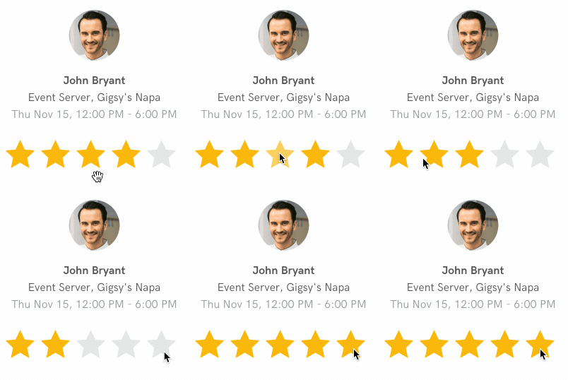
The solution we used depends on behaviors that replace content with hidden fragments on the screen. The unit of replacement is a "rating container". A "rating container" represents a specific star selection, and consists of the markup to render the selected stars, along with a hidden <text-field> with the selected value.
Here's the rating container representing 3 selected stars:
<view id="star3" style="Rating">
  <image
    source="/static/img/biz-app/star_filled%402x.png"
    action="replace-inner"
    href="#star1"
    style="Rating__Star"
    target="rating"
  >
    <behavior action="replace-inner" target="ratingError" href="#null" />
  </image>
  <image
    source="/static/img/biz-app/star_filled%402x.png"
    action="replace-inner"
    href="#star2"
    style="Rating__Star"
    target="rating"
  >
    <behavior action="replace-inner" target="ratingError" href="#null" />
  </image>
  <image
    source="/static/img/biz-app/star_filled%402x.png"
    action="replace-inner"
    href="#star3"
    style="Rating__Star"
    target="rating"
  >
    <behavior action="replace-inner" target="ratingError" href="#null" />
  </image>
  <image
    source="/static/img/biz-app/star_empty%402x.png"
    action="replace-inner"
    href="#star4"
    style="Rating__Star"
    target="rating"
  >
    <behavior action="replace-inner" target="ratingError" href="#null" />
  </image>
  <image
    source="/static/img/biz-app/star_empty%402x.png"
    action="replace-inner"
    href="#star5"
    style="Rating__Star"
    target="rating"
  >
    <behavior action="replace-inner" target="ratingError" href="#null" />
  </image>

  <text-field name="rating_by_business" value="3" hide="true" />
</view>
Note that the first 3 stars use a filled image, the last two use an empty image. Each star image has a press behavior that will replace the inner content of "rating" with the rating container representing that number of stars.
Also note the <text-field> at the bottom of the container with name name="rating_by_business" and value="3".
The rating containers for stars 1-5 are included in the doc outside of the screen in a hidden wrapper.
<screen>
  <form style="Flex">
    <view id="rating" style="RatingContainer">
      <!-- rating containers get swapped in here -->
      <!-- Currently, 3 stars are selected -->
      <view id="star3" style="Rating"><!-- markup for 3 stars selected--></view>
    </view>

    <view
        href="/biz_app/gigs/shifts/dj4kXoN/feedback"
        verb="post"
        target="body"
        show-during-load="savingButton"
        hide-during-load="saveButton"
        action="replace"
    >
      <view id="saveButton" style="BottomSheet__Button">
        <text id="saveLabel" style="BottomSheet__ButtonLabel">Done</text>
      </view>
    </view>
  </form>
</screen>

<view hide="true">
  <view id="star1" style="Rating"><!-- markup for 1 star selected--></view>
  <view id="star2" style="Rating"><!-- markup for 2 stars selected--></view>
  <view id="star3" style="Rating"><!-- markup for 3 stars selected--></view>
  <view id="star4" style="Rating"><!-- markup for 4 stars selected--></view>
  <view id="star5" style="Rating"><!-- markup for 5 stars selected--></view>
</view>
When the user presses "Done", we make a POST request to the server. Since the "Done" button is contained in a <form> element, any input field in the form will be serialized with the request. This means that the hidden field with name="rating_by_business" will be sent to the backend, reflecting the UI state.
