
Tabs
By using <select-single> with selection styles and behaviors, we can create a tabbed interface that allows a user to switch between two pieces of content on one screen.
Let's start with the markup for the tabs. Since only one tab can be selected at a time, we can use <select-single> to capture this state:
<doc xmlns="https://hyperview.org/hyperview">
  <screen>
    <body style="Main">
      <select-single name="tab" style="Tabs">
        <option value="users" style="Tab">
          <text style="Tab__Label">Users</text>
        </option>
        <option value="groups" style="Tab">
          <text style="Tab__Label">Groups</text>
        </option>
      </select-single>
      <view id="tabContent" />
    </body>
  </screen>
</doc>
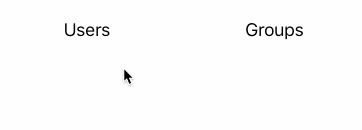
The result:
Using <style> rules with a <modifier> element for the selected state, we can visualize which tab is currently selected:
<styles>
  <style id="Main" flex="1" paddingTop="48" backgroundColor="white" />
  <style
    id="TabContent"
    flex="1"
    justifyContent="flex-start"
    alignItems="center"
    paddingTop="24"
  />
  <style id="Tabs" flexDirection="row" height="40" />
  <style
    id="Tab"
    backgroundColor="white"
    flex="1"
    flexDirection="row"
    justifyContent="center"
    alignItems="center"
  >
    <modifier selected="true">
      <style backgroundColor="#ddd" />
    </modifier>
  </style>
  <style id="Tab__Label" fontSize="18" fontWeight="normal">
    <modifier selected="true">
      <style fontWeight="bold" />
    </modifier>
  </style>
</styles>
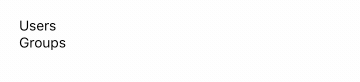
Note that modifier states apply to the children of an <option> element. This means we can change the look of the tab label when the tab is selected.
We now have some basic tabs that toggle when pressed:
All that remains is to add behaviors to the <option> elements that will replace the container content:
<doc xmlns="https://hyperview.org/hyperview">
  <screen>
    <styles>...</styles>
    <body>
      <select-single name="tab" style="Tabs">
        <option
          value="users"
          style="Tab"
          trigger="select"
          href="/users"
          action="replace-inner"
          target="tabContent"
        >
          <text style="Tab__Label">Users</text>
        </option>
        <option
          value="groups"
          style="Tab"
          trigger="select"
          href="/groups"
          action="replace-inner"
          target="tabContent"
        >
          <text style="Tab__Label">Groups</text>
        </option>
      </select-single>
      <view id="tabContent" style="TabContent" />
    </body>
  </screen>
</doc>
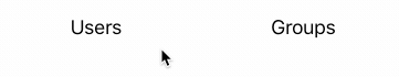
When a tab triggers a "select" (aka when the user selects the tab by pressing it), we request the tab's content and replace the elements in tabContent with the response:
Due to the delay of a remote request, notice that the appearance of a tab's content lags behind when the tab is selected. To address this, we can add a tab loading state.
<doc xmlns="https://hyperview.org/hyperview">
  <screen>
    <styles>...</styles>
    <body>
      <select-single name="tab" style="Tabs">
        <option
          value="users"
          style="Tab"
          trigger="select"
          href="/users"
          action="replace-inner"
          target="tabContent"
          show-during-load="spinner"
          hide-during-load="tabContent"
        >
          <text style="Tab__Label">Users</text>
        </option>
        <option
          value="groups"
          style="Tab"
          trigger="select"
          href="/groups"
          action="replace-inner"
          target="tabContent"
          show-during-load="spinner"
          hide-during-load="tabContent"
        >
          <text style="Tab__Label">Groups</text>
        </option>
      </select-single>
      <view id="tabContent" style="TabContent" />
      <view id="spinner" hide="true" style="TabContent">
        <spinner />
      </view>
    </body>
  </screen>
</doc>
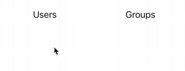
Below the <view> for the tab content, we add another view that includes a spinner. This view is hidden by default. When the user selects a tab, we use hide-during-load and show-during-load attributes to show the spinner and hide the existing tab content:
In the example above, there's no default state selected when the screen first loads. In a real-world scenario, one of the tabs would be pre-selected and the tab content would be pre-populated in the initial server response.